Baskerville Type Analysis
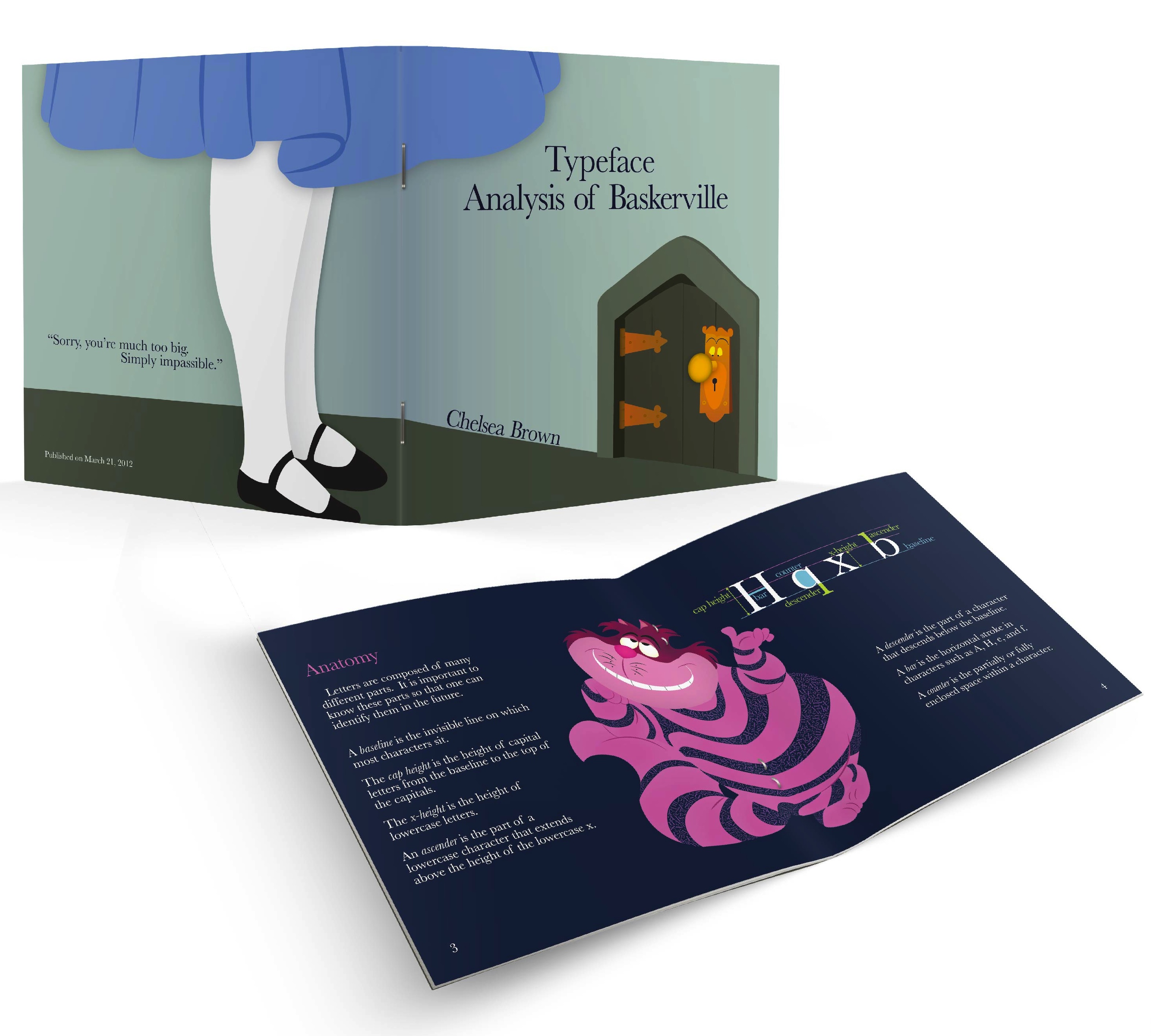
A font analysis of Baskerville was created to target middle school aged students to educate them on font and typography basics. An Alice in Wonderland theme was used to grab their attention, and every background image incorporates type in a whimsical way. A somewhat dark and mystical color scheme was used to play off of the theme.
![]()
![]()
