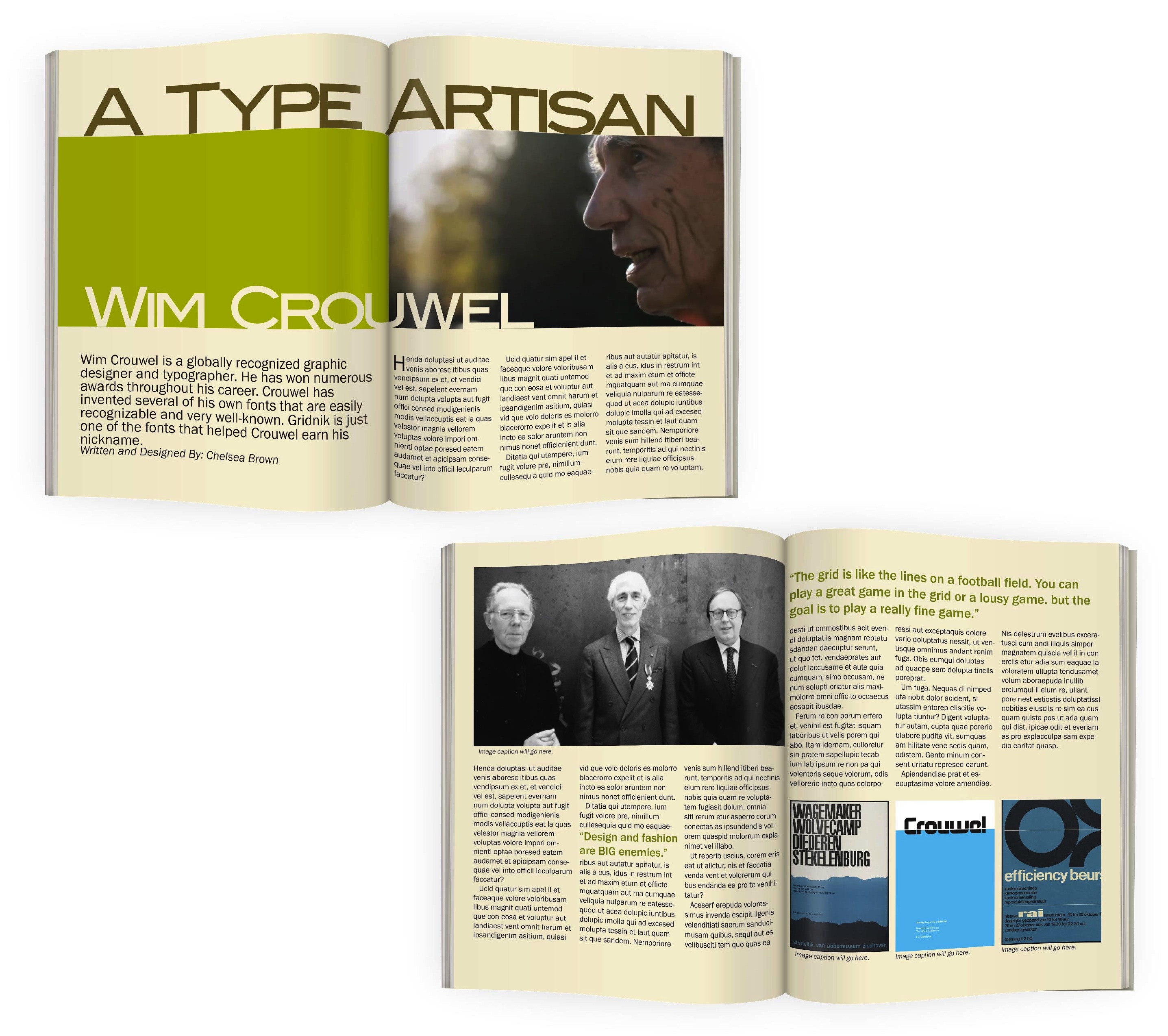
Wim Crouwel Magazine Spread
This magazine spread was created to showcase designer Wim Crouwel. An underlying grid theme was used in conjunction with a modernist approach to represent and honor Crouwel’s work. A retro, modern color scheme was used to tie in colors that Crouwel often gravitated toward.
![]()
